Tallying the contributions of the MapSwipe community
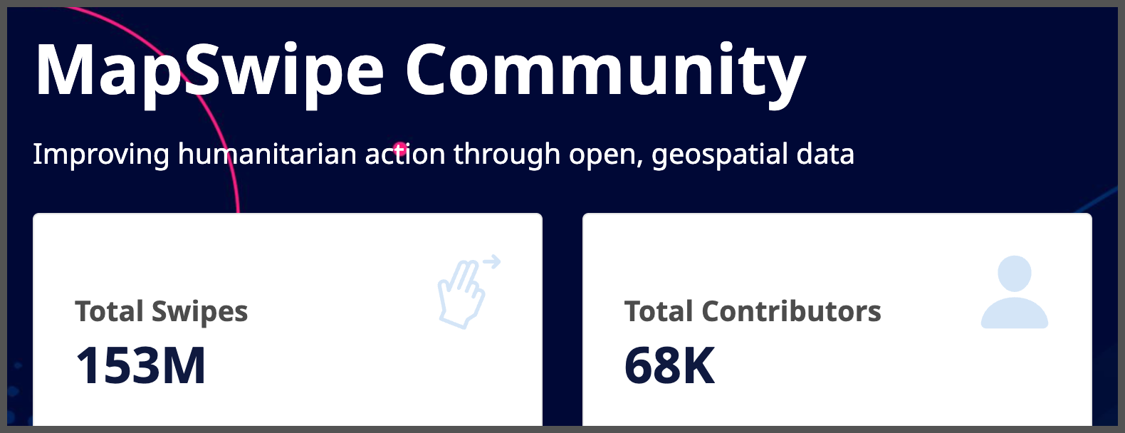
Among other statistics that are now readily available, we have running totals for number of swipes and contributors.
Crowdsourcing geo data with MapSwipe
MapSwipe is an open-source mobile app that helps organizations crowdsource the creation of geospatial data. Using such data to understand places and the “where?” of things is vitally important; not just for getting from point A to point B but for coordination, understanding needs, tracking impact, identifying gaps, and a multitude of other concerns.
MapSwipe missions present small groups of simple tasks to app users contributing their time. In the original MapSwipe ‘Build Area’ mission type release in 2016, volunteers swipe through satellite images and tap imagery tiles in which they’ve located particular features such as buildings. In more recent years, the MapSwipe community has added new mission types including for change detection and footprint review. Each small task is completed by multiple individuals to create a mechanism for internal validation of results, facilitating more useful and trustworthy data generation.
Tallying contributions
Much of the software development work on MapSwipe has focused on the mission types and the various data being created. As such, the functionalities and analytics readily available around engagement levels have been limited. Previously, there was a basic leaderboard showing total swipes of users active on the app during the previous day. Also, when logged into the app an individual user could check their total swipes.
We recognize that keeping users informed about their contributions on the app is key to their overall enjoyment and continued engagement in the MapSwipe experience. Users create valuable geospatial data for the organizations behind the MapSwipe missions and we want users to understand how they are contributing. So we are excited that the American Red Cross has supported the development and launch of new functionalities for contribution analytics including the concept of groups which allow users to aggregate tallies of their efforts.
The MapSwipe community is cautious regarding potential negative consequences of too much gamification, such as users valuing speed or quantity over quality. Therefore, we focused on telling the story of contributions rather than comparisons that might induce competition. So that users can better understand their individual and collective contributions we’ve launched an enhanced profile page in the app, and also launched online pages for the overall community, individual contributors, and the newly introduced groups.
To check out the changes, launch MapSwipe and look for the “Profile” tab that has replaced the (perhaps confusingly named) “More” tab. If you’re not on MapSwipe yet, it’s available in the Apple App Store or on Google Play. As part of your profile, you’ll notice new statistics such as your total time spent swiping, how many missions you’ve contributed on, and how many organizations you have supported. There’s also a “More Stats” link that will take you to your profile on the web. On the web you will find additional graphs, charts, and even a map showing where you have contributed.
What have we accomplished together?
With the completion of this software project, we can now access details about the history of contributions on MapSwipe. By filtering the community page to 2016 to 2022 we can see the recent growth of MapSwipe. In 2021, users together spent a total of almost 4 months in MapSwipe swiping and searching for buildings or solving the other mission tasks. In 2022, that number jumped to 1 year. That is, one person would have had to swipe non-stop for all of 2022 to equal the total contributions of all users during the year.
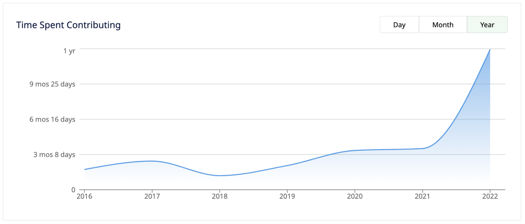
After several comparable years for total time spent by users contributing on MapSwipe, there has been an increase, especially in 2022.
While we may be a long way from having MapSwipe missions in every country, there have been missions in a variety of geographies around the world as seen in this heatmap of mission locations.
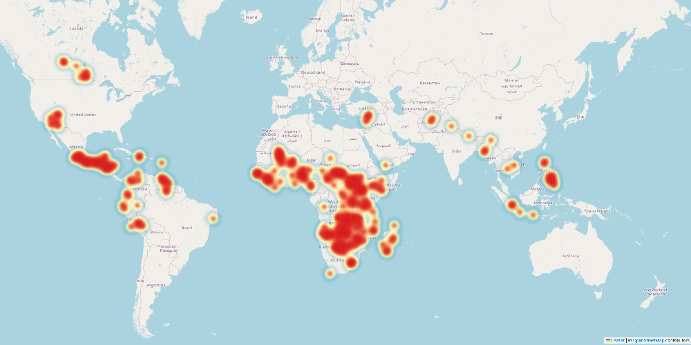
The size and intensity of the colors on this map indicate the geographic locations and numbers of MapSwipe missions from 2016-2022.
Please take a look for yourself at https://community.mapswipe.org/. You can search by user or group, and every page can be filtered to a particular date range. What stands out to you? What trends do you notice? We hope you are as excited as we are by the insights possible!
Thank you
As this project was larger than the core maintainers were able to complete on their own, we worked with Togglecorp - a software development company based in Nepal with an impressive portfolio including previous work with American Red Cross, the IFRC, and other humanitarian organizations. However, neither this project nor MapSwipe as a whole would be possible without the generous involvement of the community.
On top of the work by the developers at Togglecorp, the core maintainers were still involved in guiding, reviewing code, and otherwise helping guide the project. We have many volunteers helping translate the new text in the app to make it more accessible. Volunteers provide feedback on the design and direction of MapSwipe. Organizations trust MapSwipe to create useful geospatial data. And, as is readily known by checking the community contribution page, there are over 68,000 people that have contributed on the app! A big thank you to everyone involved - past, present, and future.